Commentary
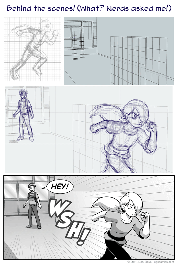
This is a glimpse into some of the behind the scenes process for a recent story comic.
Background Guides
While I do know a lot about drawing in perspective, I am slow at manually setting up perspective lines. I run into trouble just getting started with proper vanishing points, to be honest. Given the number of panels I have to draw and how much I want scenes to be consistent, I used to use the shortcut of using 3D rendered scenes made in Google SketchUp as guides and references (I still use 3D , but have moved on to different programs, particularly after SketchUp was sold and license agreements changed).
Even though I am using 3D software to help, however, it doesn't do all the work for me. In addition to still needing to do all the final line work and such, I have to design and create the environments. I have had to learn several architectural rules of thumb as a result, and a single environment can take a good while to make depending on how much detail there is.
There is the advantage that Google SketchUp has a community of modelers who share their work, but I have a tendency to want to make any models I use as reference and/or guides from scratch, thus explaining why I spent a fair amount of time on the staircase in Tedd's basement when I probably could've just downloaded something. Carl Sagan would probably have a thing or two to say about that, but whatever. I'll create a universe and apple pies later.
(For those scratching their heads, Carl Sagan quote: "If you want to make an apple pie from scratch, you must first create the universe.")
Besides which, my main concern with objects is where they go in the scene and what their proportions are. Which brings us to...
Justin and Simple Guides
The placement guide for Justin is just a line that matches his height and has rectangular dividers. The width of, length of, and distance between each divider matches the height of Justin's head (if he was bald). Most of my humanoid characters have the same head size, so it's a pretty universal unit of measure for me.
That's what I meant by my main concern being where the objects go and their proportions. I don't need a perfect 3D representation of what I want to draw, I just need something to keep track of where it is, how big it is, and a way to help keep the perspective right (hence the nature of the dividers).
Another example is Brownie. I've kept track of Brownie's placement in scenes by simply using a cube with some lines on it. Anything more elaborate would be excessive.
Speaking of excessive...
Noah
I have trouble drawing people running, particularly in perspective. One very simple problem I run into with running is how tall a character effectively is when they're hunched over, which was the basic problem I was trying to address when I sketched a side view of Noah running. It then occurred to me that it basically provided a guide that could translate into perspective if I was willing to do a little extra work with it.
And that's why Noah has two grids instead of just a simple guide like Justin (each square in the grid equals one square head, if that makes any sense). Using the sketch as a reference and what I know about drawing in perspective, I could use those two grids to do halfway decent job of drawing running Noah in perspective, which I really wanted. While I'm not entirely happy with the composition of that panel, I remain happy that I didn't just go with a side view of Noah dashing off. Besides which, it was a good learning experience for me.


