Commentary
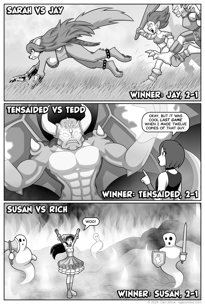
I want certain characters to play against certain other characters each round, and I'm also trying to have who-plays-who make sense in-universe. This means some of the results are at the mercy of what's necessary for the story.
Some, however, are not. Susan could have won or lost this round without ruining any of my plans, and I had intended for her to lose simply because it would have been slightly more interesting than her simply winning another round.
Then I imagined panel three.
Sorry, Rich, but I wanted that panel. Don't take it too badly, though. Just the fact that you were up against Susan implies you won the first round.
Werewolf feets
I wanted werewolf Sarah to have digitigrade feet like a wolf (basically walking on what we'd consider toes), but we didn't get to see her feet before, so I wanted to show them here.
Tedd
I've been wanting to draw feminine masculine Tedd, and I took the opportunity.
Authorial intent is that Tedd's beginning to see gender as less of a binary thing. This is also reflected in Tedd's more recent fashion choices, but it's less subtle here.
Delays and Backgrounds
This page was delayed because I had a goblin left to ink and shade (the one with the club directly behind werewolf Sarah), and the first and third background left to do at around two in the morning my time. I wasn't sure exactly how I was going to do the backgrounds, and even if I did, it was already way later than I should've stayed up.
I should have accepted the delay was going to happen hours before then, but as tends to happen, I REALLY didn't want to.
On the plus side, because it was delayed anyway, I took my time playing around with those two backgrounds, and experimenting a bit.
I used edited photos of clouds for the clouds and smoke on this page (I've gotten a lot of mileage out of having said "ooh, clouds" and taking pictures one day). The rough texture of the ground in panel three is actually from a photo of carpet taken at an angle.
(Note: If taking pictures of clouds, don't point your camera at the sun.)
The third panel was originally going to be less smokey, but I saw what it would look like to put the cloud texture over everything by accident, and I liked the result.
--


