
Commentary
Requested by David Paye - George as an old-timey news reporter
Cheerleadra wasn't part of this request, but I felt that there needed to be something George was failing to notice, and a silhouette of one character over a simple background wasn't exactly anything close to resembling overdoing things. I was tempted to give George a 3DS, but that wouldn't exactly be old-timey reporting, would it?
And Now To Get Technical
This sketchbook is significant from a behind the scenes perspective as it is the first to make use of the culmination of inking style experimentation I've been doing lately. I've been pushing an evolution of my style with consistency of style for zoomed in and out characters being a major part of it.
I've previously had an obsession with keeping general line thickness consistent no matter how zoomed in or out on a character, and it's an obsession that made it really easy to break my style. Here's how I'd been doing things. Imagine each circle is the same size, but different distances away:
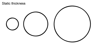
By keeping the line thickness constant, it effectively makes the lines thicker or thinner. Sometimes this would be fine, but zoomed in or out too much, and it would look wrong. This has been a significant issue with sketchbooks in particular, but it's affected everything.
While writing commentaries for part 3 of Night Out, I realized I really liked certain aspects of the style I had going back then. I decided I wanted to try to incorporate those aspects into my modern style, and to start using relative line thickness that would change depending on how zoomed in on a character.
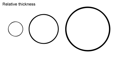
In addition to keeping characters in style regardless of how zoomed in or out they are, this helps create an illusion of depth. I've been using Grace from panel one of this EGS:NP as my barometer for relative line thickness, and it's been working pretty well. Sometimes I need to just go with what my eyes say look good if significantly zoomed in or out, but for the most part, I can just go by how thick the lines would be on that image of Grace if she were in a particular spot in a panel.
Have I mentioned that I put a LOT of thought into line thickness and that's it's kept me up at night in the past? Well, I do, and it has. I'm feeling pretty good about it now, though.
Requests are paraphrased for clarity and brevity


![]()
![]()