Commentary
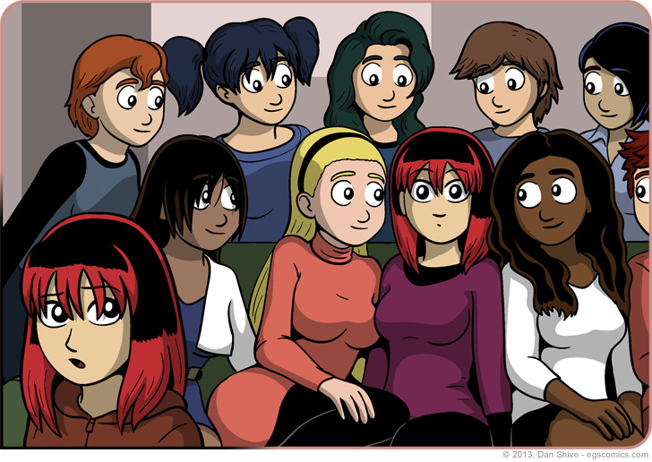
Another comic commentary about a panel filled with color and made bigger?! Um... Stuff? Okay, this one's a little different. The size increase is a bit more dramatic this time around, and I removed text! So it's completely different, right?
The answer is yes.
Not all of the colors here are exactly what I imagined for the characters they're applied to, but I felt they worked pretty well for this particular image given that Nanase's color scheme should at least be close to normal, so I went with them. That's one of the reasons the comic's normally in greyscale in the first place. Color composition is a lot tricker than most people seem to give it credit for, and simply deciding on what colors to use can add a lot of time to production. These single-panel colorizations don't need to worry about consistency, so there'll a little easier, but they still take longer than one might assume.


