Comic for Friday, Nov 26, 2010
Commentary
Posted November 26, 2010 at 1:00 am
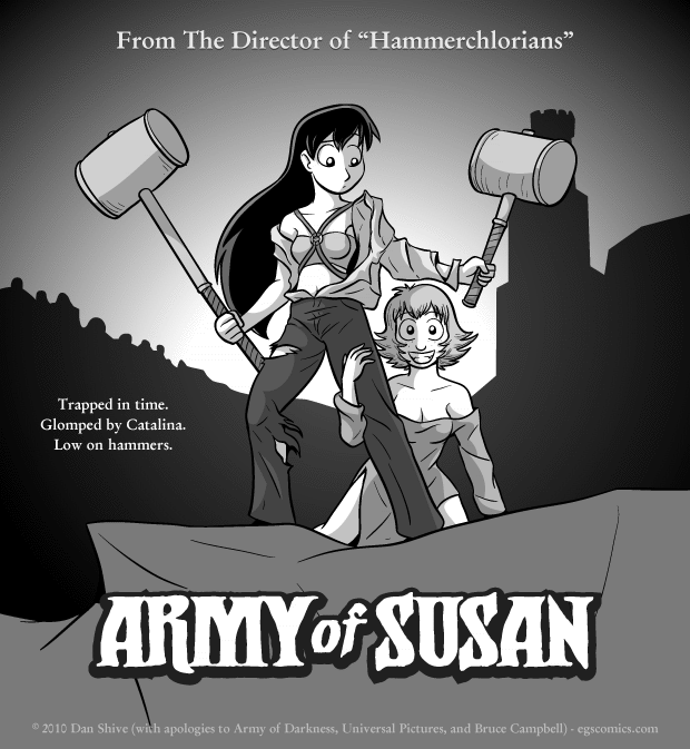
I'm not a huge fan Army of Darkness. Don't get me wrong; I think it's fun, nifty, and Bruce Campbell is awesome. It's just not on my personal top list of movies to watch, and not being big on horror movies in general, the Evil Dead series doesn't have the strong nostalgic value for me that it has for a lot of other people.
I do, however, really like the movie poster for it. It's a movie poster from a time when people knew how to make damn good movie posters. While I'm sure there were many boring movie posters back in the day, it feels like there's a higher percentage of boring movie posters these days.
I think part of the problem is that a lot of the posters are primarily photographs or CGI. I'm not saying they aren't well done or sound from the standpoint of graphic design, but all things are relative and the best painted posters just have so much more going for them. It seems like several modern posters were made by rendering a scene, or even just a character, in a 3D modeling program and slapping on a logo.
Anyway, I'm betting some of you are disappointed that Susan has both of her hands given that Ash traded his in for a chainsaw (how did that work? Eh, who cares). While replacing her right hand with a hammer is the obvious choice, the idea of removing any of Susan's limbs weirds me out, so... yeah. She got to keep her hand.


