Comic for Thursday, May 13, 2010
Commentary
Posted May 13, 2010 at 1:00 am
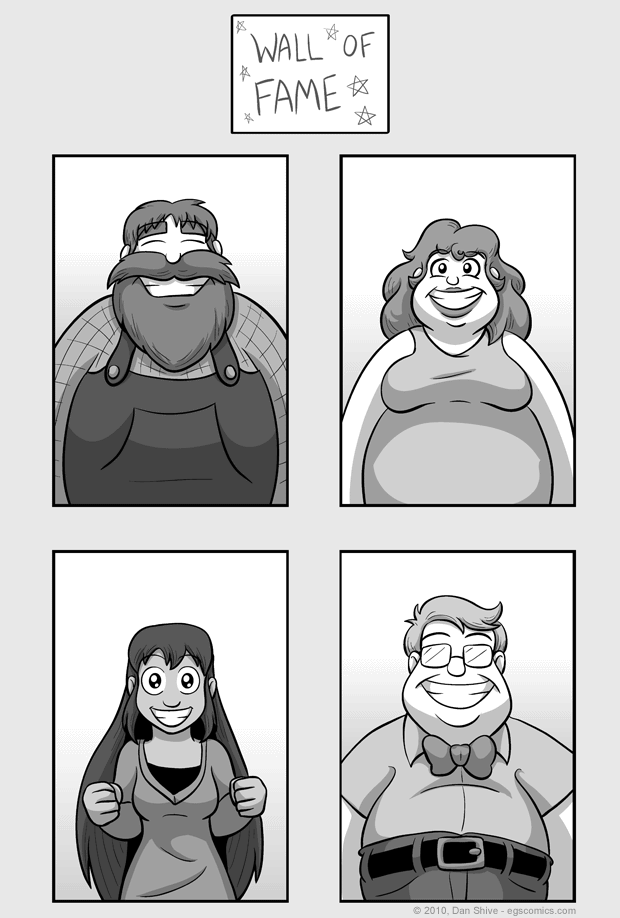
These are the full versions of portraits made for a recent story comic. In that comic's commentary, I chastise myself for drawing for spending too much time on images that are just going to be shrunk down cropped anyway, and all it takes to see why is comparing this sketchbook to how they look in the final product. I drew way more than necessary.
This is the sort of thing that would be less likely to happen if drawing off the computer. Similar scaling issues could occur, but when working on the computer, I zoom around like a dune buggy. I zoom in, I zoom out, I zoom here and there and everywhere and it can be easy to lose sight of how big something is actually going to be online and in print.
On the plus side (no pun intended), it makes for a halfway decent sketchbook entry. The previous sketchbook entry was an attempt to come up with people for the wall, but I didn't actually use any of them. The only design I really had anything specific in mind for was the first one with the beard. For him, I was thinking "lumberjack".
For the other two non-Grace wall of famers, I just drew really round people and added whatever decoration seemed to fit. It seems a shame that none of them look like stereotypical truckers, except for maybe that first one again. I suppose he could be a lumberjack trucker, chopping down trees and delivering the lumber himself. That works. Just to be on the safe side, however, I might have to make Grace being a trucker official canon.


