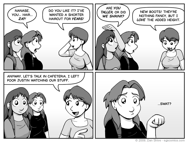
Comic for Saturday, Mar 21, 2009
El Goonish Shive Introductions The Goo Shade, Part 1 Q&A #1 Shade, Part 2 Relations, Part 1 April Fools Week Relations, Part 2 Catnip Sister Part 1 - Open The Box Part 2 - Read The Rules Part 3 - Set Up The Pieces Part 4 - Play The Game Part 5 - Knock The Board Over Part 6 - Scattered Pieces Part 7 - Fist Fight Part 8 - Clean Up New And Old Friends Flipping Cardboard Lady Mysterious II slooF lirpA Squirrel Diplomacy Lunchtable Revelations Night Out Part 1 - Martial Arts Crew Part 2 - Elliot's Crew Part 3 - Ellen's Crew The Morning After Q&A #2 Tam Eh Tedd Painted Black Part 1 - Walk In The Park Part 2 - Missing Persons Part 3 - Interviewed By The Devil Part 4 - Into The Dungeon Part 5 - The Truth About Grace Part 6 - The Brewing Storm Part 7 - Fallen From Grace Part 8 - Humanity PB Special Features Shadows After Dark Sleepy Time Second Life The Child Left Behind Red Alert Before The Party Moping Squirrel Intro to South Party Recruiting Even More Recruiting Party Fashion Family Reuinion Grace's Birthday Party Part 1 - Arrivals And Presents Part 2 - Bending Genders Part 3 - Festivities Part 4 - Hold On Hope The After Party Q&A #3 Hidden Genesis Hidden Genesis In The Shadows The New Students Susan Draws The Line Squirrel In The Classroom Sister 2 Part 1 - The Trials Of Susan Part 2 - The Statue Part 3 - Pent-Up Magic Part 4 - Evil Monkey Part 5 - Moperville News Part 6 - Weregirl Part 7 - The Dark Clouds Gather Part 8 - Talon vs. Scythe Part 9 - Wrath of God Part 10 - Pandoras Box Q&A #4 Q&A #4 Bringing Silly Back Indiana Elliot And The TOSF T-Minus The Demon Ally Hammerchlorians - 1 Hammerchlorians - 2 Hammerchlorians - 3 T-Minus Dark Allegiance New And Old Flames - 1 New And Old Flames - 2 New And Old Flames - 3 New And Old Flames - 4 New And Old Flames - 5 New And Old Flames - 6 Q&A #5 Q&A #5 9001% Serious One Way Road Legends of Celida Death Sentence - 1 Death Sentence - 2 Death Sentence - 3 Death Sentence - 4 Death Sentence - 5 What Is Love Summer The End Of Spring Power Fantasy Rocks Fall Nobody Is Hired Nepotism Hair By The Numbers Duel Of The Discs There Be Whales Here There Be Whales Here Pt 2 There Be Whales Here Pt 3 The Dawn End Of An Era End Of An Era pt 2 Family Tree Family Tree Part 2 - Arrival Family Tree Part 3 - Par-TAY Family Tree Part 4 - Weirdness Family Tree Part 5 - A Troll Family Tree Part 6 - Banhammered Family Tree Part 7 - Hangover Q&A #6 Identity Identity Part 2 - Reactions Identity Part 3 - Cat Attack Identity Part 4 - Detective Sarah Identity Part 5 - Basement Chat Identity Part 6 - ILLOGICAL! Identity Part 7 - Dreams identity Part 8 - Ashley Identity Part 9 - Detective Susan Identity Part 10 - Ashley and Elliot Identity Part 11 - Epilogue Summer Moments Guest Comics Guest Comics #1 Guest Comics #2 Pandoras Box Squirrel Prophet SP - Part 2 SP - Final Battle So A Date At The Mall So A Date - Part 2 So A Date - Part 3 So A Date - Part 4 So A Date - Part 5 EGSNP - Question Mark Q&A 7 - The Requestioning Sister 3 - Catspaws Part 1 - Legacy Part 2 - The Will of Magic Part 3 - Reply Hazy Part 4 - Everyone Needs To Talk Part 5 - The Reservoir Part 6 - Maybe Sisters Part 7 - An Unkindness Part 8 - Awkwardness Ahead Part 9 - Traffic Freeze Part 10 - Fluidity Part 11 - All Of The Curse Words Part 12 - Misanthropy Part 13 - In Search Of Wisdom Part 14 - Sister Anxiety Part 15 - Elliot and Ellen Part 16 - BFFs Part 17 - Great Fairy Godmother Part 18 - Gathering Monsters Part 19 - Family Meetings Part 20 - Geminis Part 21 - The Other Dunkel Part 22 - Apocalypse Part 23 - The Fate Of Magic Part 24 - Elliots And Ellens Part 25 - Changes Part 26 - Epilogues The New World The Legend of Diane The Secret of Sam Q&A 8 - The Lord Of The Q&As Title Pending Title Pending 2 - Even More Pending Title Pending 3 - Untitled Party Title Pending 5 or 6 Balance Part 1 Part 2 Part 2-B Part 3 Part 4 Part 5 Part 6 Part 7 Part 8 Part 9 The Road Ahead Brother Father Our Future Recruitment Layers, Part 1 Layers, Part 2 Layers, Part 3 Layers, Part 4 Hope, Part 1 Hope, Part 2 Hope, Part 3 Hope, Part 4 Hope, Part 5 Hope, Part 6 Hope, Part 7 Hope, Part 8 Hope, Part 9 Hope, Part 10 Hope, Part 11 Hope, Part 12 False Kings False Kings, Part 1 False Kings, Part 2 False Kings, Part 3 False Kings, Part 4 False Kings, Part 5 False Kings, Part 6 False Kings, Part 7
Commentary Posted March 21, 2009 at 1:00 am
TITLE: Sad Kitty Ellen


