Comic for Tuesday, Nov 11, 2008
Commentary
Posted November 11, 2008 at 1:00 am
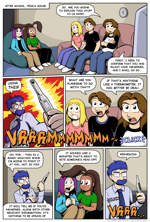
If the party story arc was chronologically further back, I would have added some furniture and possibly a painting to the first panel. Given how recently that was, however, I don’t want to drastically redecorate the Verres household just yet. I figure that the bean bag and rug are acceptable additions.
Speaking of decoration, where’s Jeremy? He’s a perfect prop for a scene such as this. I suspect I was too distracted by figuring out the layout for this scene and the perspective in panel one that I didn’t think to include our fuzzy little friend. Not that he’d stick around once the Magic Analysis wand was turned on, but he could’ve sat there and looked cute in the first panel.
You know what? Scratch that. I didn’t forget Jeremy; I mercifully had him napping upstairs and away from the sound of the wand. Yeah, that’s the ticket!
It’s been a while since Sarah has had her hair down like this. The only difference is that she hasn’t combed it back behind her ears, so it’s not like she mysteriously got a hair cut between school and going to Tedd’s house. My excuse is that she wore the beret all day and was tired of having her hair resting up against her ears. From a design standpoint, I just wanted to change things up a bit.
I originally envisioned Grace’s eyes being closed in panel five, a sort of look of mature patience when dealing with someone less mature who is upset. While I liked the look, however, it was somewhat out of character for Grace to the point of making it unclear as to why her eyes were closed. I could have made her say "there there" to drive the point home, but that would also be out of character, and would drag out the final punch line.
Tedd’s description of what the wand sounded like used to be more elaborate with additional adjectives and a mention of space marines. I think it works better after the edit. If this was 2002, he probably would have had a second paragraph describing his dislike of the sound.
I hope that it’s clear that the lighting effects in panel two are dramatic license and not real. I have to be careful in a fantasy comic such as this, but given that the light is normal in panels three and six, I would like to think that it’s apparent that only the sound is not exaggerated.
I’m still figuring out the finer points of shading in this comic. I strategically used less pure black shadows, but there are places where I should’ve kept more. Some of the darker colors have less natural contrast with the shadows, such as Grace and Elliot/Ellen’s hair, and I think those areas should have more of those maximum contrast black shadows. Not a whole lot more, but enough for boosted contrast. We’ll see if I still think that’s true later on.


