Commentary
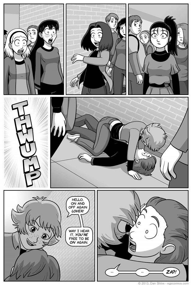
I don't really have much to say about this comic that doesn't veer into spoiler territory beyond the excitement of... TYPOGRAPHY!
*Applause*
I wanted a wide sound effect font for panel 4's "thwump", but absolutely everything I had was too narrow for my liking, and I don't like just stretching out fonts. Fonts are carefully made (or, at least, they should be), and stretching them out unevenly rarely gets good results.
I spent a little time shopping for a new font, but I didn't see anything that fit the bill, so I just made my own dang letters. It's not like I needed to make a whole font with every letter and kerning and leading and such. I just needed six letters for a sound effect, so BAM! Er, THWUMP!
Of course, this is the part where people get to say "so THAT'S what's wrong with it", but I still say it looks better than the various font options I had available. It's possible I really should do some more font shopping,


