Comic for Friday, Oct 8, 2010
Commentary
Posted October 8, 2010 at 1:00 am
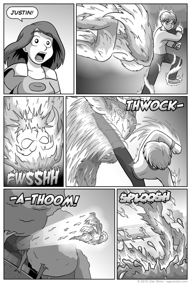
Before anyone accuses me of suddenly putting a convenient river there, its presence has been hinted at and the bridge in panel six have been in the comic before. I was going to say we've seen the river before, but looking back at the art in that earlier comic, what exactly was below the bridge wasn't all that clear. I apparently applied a water texture and tried to make it clear, but I wouldn't blame someone for thinking it was another road or something down there.
Justin's poses in this comic might not be perfect, but it's not for a lack of trying. I put a fair amount of effort in trying to figure out his stance both before and during the kick, posing as best I could myself, then trying to match my little models to what I did so I could visualize it. While I'm certain my old Hapkido instructor could nitpick the heck out of this, the Martial Arts training from my teen years did help me with this.
Inking a comic like this gets surprisingly complicated surprisingly fast simply by virtue of the fact that it uses different shades for outer lines on overlapping characters. It takes a bunch of stuff that would normally be on one layer in the art program and makes it several just to makes sure everything's in the right order. Add in the fact that the fire guy glows the way he does, and it becomes more complicated.
I don't know if that's a fun behind the scenes fact or not. I just wanted to get that bit of "GAH THIS SHOULD BE EASIER" frustration off my chest.


