Commentary
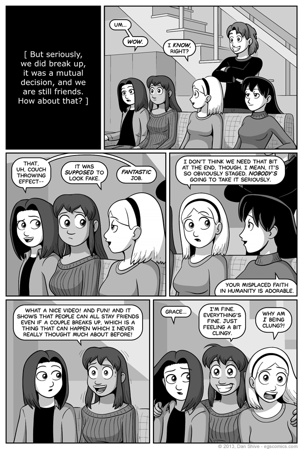
In case you're wondering, ways in which I tried to make the couch look fake in the previous comic:
- Used a single image for the couch that is reused both panels (it's resized and rotated; nothing else).
- Intentionally didn't match the perspective, shadows, or really anything to rest of the scene.
- Included motion lines on Sarah's arms, but not on the "thrown" still image of a couch.
- The cushions are completely stationary.
- The couch changes size.
- When looked at carefully, Sarah's hands in the fourth panel clearly aren't holding up the couch.
- The couch is way too small to function as a decent couch in either panel, but it's especially too small in the fifth panel.
I considered intentionally saving the couch as a poor quality jpeg to make it look really bad, but I considered that to not only be overkill, but also something Sarah (who I'm just going to go ahead and say made the couch graphic for this) wouldn't have saved the photo in such a format, and especially not after going through the trouble of masking the photo to only be the couch.
So basically, one of the reasons I didn't intentionally make the couch look like a bad jpeg was because it would have been out of character for Sarah. I take some twisted pride in that.
... Wait, did I just devote this entire commentary to the previous comic? I'm going to take some twisted pride in THAT, too.


