Commentary
I'm not assuming everyone reading this is an expert of RolePlaying Game tropes, so there will be brief summaries of what these classes are, and why YOU should care.
This is especially the case because this is more about the players than what they're playing, and this isn't turning into a full-on RPG parody storyline.
I might also deviate from what someone might expect based on their favorite games, so this should put all of us on the same page. This is same-page-making action, right here.
Paladins
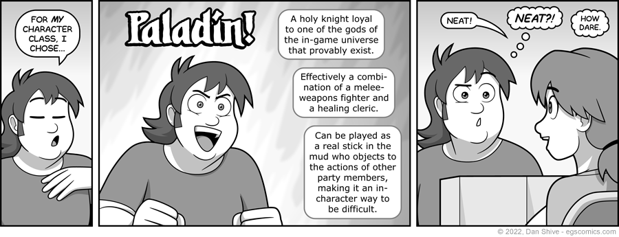
I should point out that nobody HAS to play their paladins as sticks in the mud. At least, not in most games. I've heard some games, or editions of games, had it so paladins could lose their fancy powers if other people in their party did things their god(s) wouldn't approve of, so...
Kind of hard to blame them for being sticks in the mud in THAT case.
Were Rich interested in being an unreasonable problem player, and not just a challenging one, I imagine he would've gone with a Rogue / Thief class. I've heard several stories about games that have involved problem rogues (mostly as a result of them using thief skills for the purposes of trolling with excuses like "but that's what my chaotic neutral thief would do!").
Not that I'm calling out rogue-class players. Ultimately, how you play matters more than what class you play.
It's just if you want to be a jerk character who steals from their own party and does sneaky stuff, a high dexterity stat is going to help with that.
BACKGROUNDS!
I'm taking a chance by pointing out something people might not even be thinking about, but...
I feel I need to be willing to be more minimalist on backgrounds in general, as not every panel needs a background. This is especially true in greyscale, in which not having a background can really let the characters stand out more.
(It's even MORE especially true in 100% black and white.)
But I get used to backgrounds being present, and when they're not there, I'm always asking "where's background"?
While too many backgrounds is a better habit than too few, I'm not the best at picking and choosing when to use them.
So, naturally, I was divided on what I should do with backgrounds while they're at the table. Just, um, a FEW factors resulted in me deciding to go minimalist...
1 - I'm going to be cheating the heck out of character positioning in order to show faces and poses, which could have some strange results combined with backgrounds.
2 - The various things Rich and Ellen should be overlapping with in this comic don't contrast well with their hair.
3 - Where they're sitting in the comic shop would end up showing a lot of what's behind them (ESPECIALLY with George, but also with Rich). I'd end up feeling compelled to show other customers (and Justin) to keep the store from feeling empty.
4 - Depending on who's talking to whom, there should be characters overlapping characters. Invisible George being invisible is easier to accept without background details reminding you that there should be a George there.


