Commentary
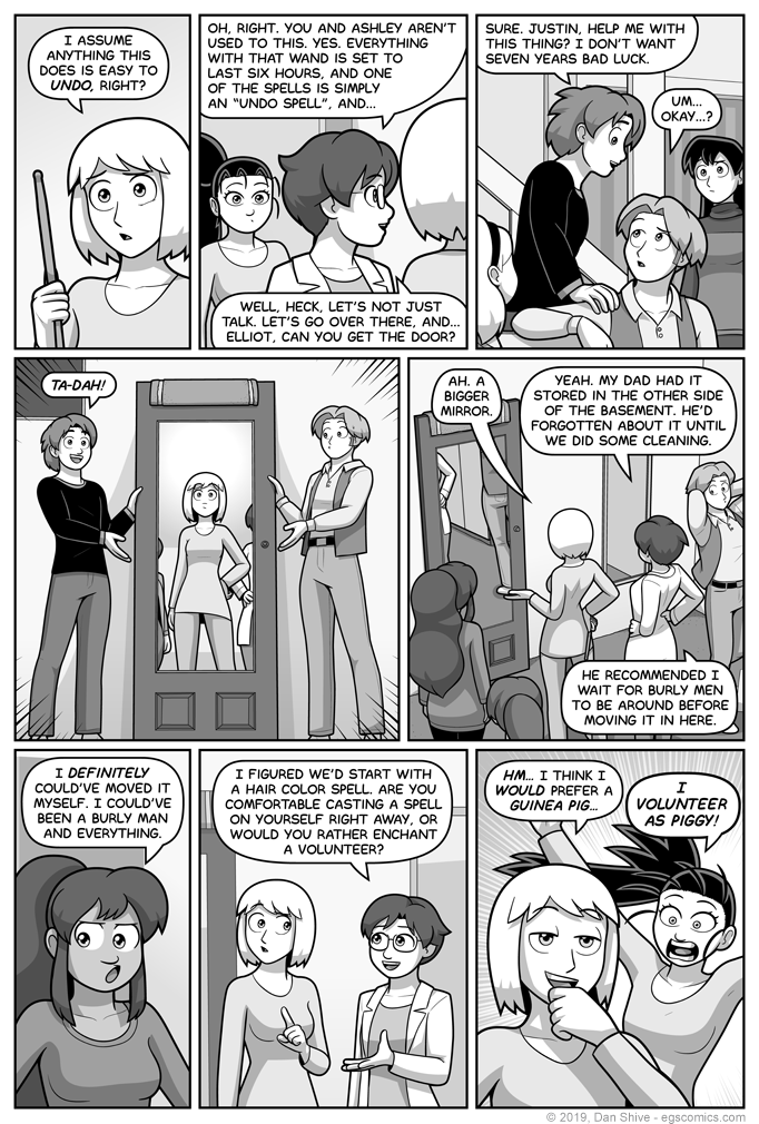
I genuinely thought this page was going to be a lot simpler, visually. I was sort of counting on it, time wise, but then... Well, a few things happened.
First, I was like "how should they carry the door? Why can't I wrap my head around this?", followed by "the heck with it, they've already set it down. It frees up a hand each for showmanship, anyway."
"Also, I really need to sell it as a mirror, so I guess a reflection should actually be shown."
Then it's like "fools! that door could scuff up the wall! Put a towel between it and the wall! Two towels? One towel. I'm sure I won't spend too much time deciding this."
Too much time later, and "wait... oh no. Panel five really needs to function as an establishing shot to show where they are, and to compare mirrors, doesn't it? Drat. I was just going to show Diane and Tedd from a flat angle, but fine..."
"Right, now to go back and settle on panel three, and... Huh. There's way too much negative space with this flat angle. This would probably work better at an angle that also shows the entrance to the other side of the basement. Also, I guess Susan was standing there, so... Yes. Susan's visible. Rock on, Susan."
"Okay, now the last two panels, and... Hold on. Grace would totally have a reaction to that 'burly men' bit. I guess it's three last panels now. Cool. Cool cool cool."
Anyway, I like it when Tedd makes use of things in ways other than intended. Granted, a mirror on a door is intended to be used as, well, a mirror, but the door itself probably wasn't intended to be turned upside down and propped up against a wall with a towel on top with the intent of being used primarily as a mirror.
I mean, maybe it was, but I have my doubts.
--


