Comic for Monday, Sep 20, 2010
Commentary
Posted September 20, 2010 at 1:00 am
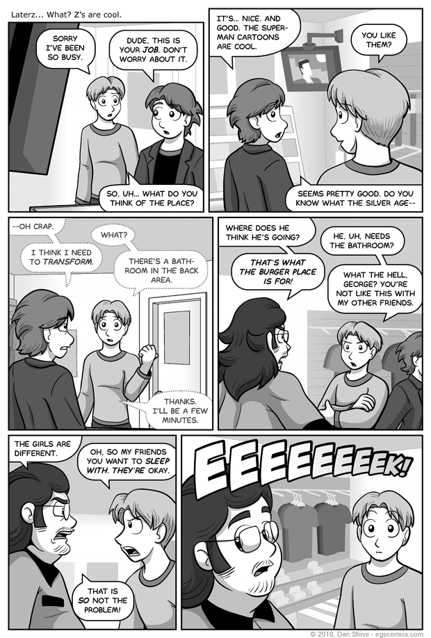
The "Superman Cartoons" being referred to here are most definitely the ones done in the Bruce Timm style. As much as the Silver Age Superman amuses me, from my perspective, the Superman from Superman: The Animated Series is the definitive Superman. It's also the series that has my favorite version of Lois Lane. What I've actually read and seen of these characters is very limited, I admit, but of what little I have had exposure to, I consider these versions are the winners.
To be honest, however, I was originally going to include a line of dialogue from the show that would have excluded it from being anything real, but simply ran out of good places to put it in the editing process. Without giving any context, I was going to have a speech bubble from the television saying "don't make me juggle Earth, Luthor!"
Panel four should ring true to pretty much anyone who has hung out in a place of business that does not allow the customers to use the store's bathroom. Any business within walking distance with a public restroom readily available quickly gains visitors from the first location.
Come to think of it, there could be a dastardly conspiracy at work there. A grand scheme of the various shop owners to make sure the local businesses all flourish together so customers have plenty of reasons to venture to that shopping location. Yes... it all makes sense now...
The layout for this comic proved extremely tricky given what I wanted to show in each panel and the order of characters talking, and I believe I screwed up with panels three and four. The positioning of Justin with Elliot in panel three and George in panel four sort of make it look like Elliot just sort of morphed into George. I don't think it's the sort of thing that would confuse anyone, but it's still not good that it looks like that. It was a realization that came too late in the process for me to do anything about without severely delaying the comic, however, so there it is.
There's probably an easier way to get a smooth progression of letters descending in size as they are in the last panel, but the method I used was approximately making each font size approximately 88% of the font size of the letter that preceded it. There have been times when I've just made the font size drop by a set number each time, and that looks fine for just a few numbers, but makes the progression less and less smooth the more letters there are.


